I enjoyed a great collaborative relationship with The Raveonettes (Sune Wagner and Sharin Foo), and designed a series of album covers for them throughout the years. The Raveonettes are a shoegaze/post-punk band that have been on both Sony and Vice Records. They’ve sold out stadium shows around the world. Fun fact: I used to be the bassist in a post-punk band in New York, and our band opened for The Raveonettes a couple times.
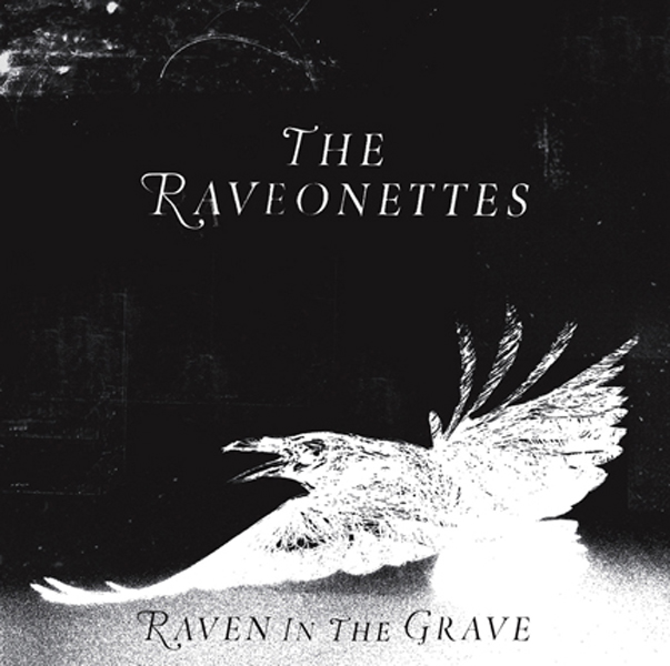
For this first album cover, I took a sketch by Camilla Staerk and ran it through various ways of distressing the texture by hand. The “ground” texture and the texture in the sky were all handmade and then scanned in.
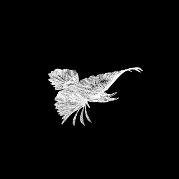
Vice Records also released a special vinyl edition, where I took the raven illustration and flipped it upside down - a visual representation of the album title Raven in the Grave.
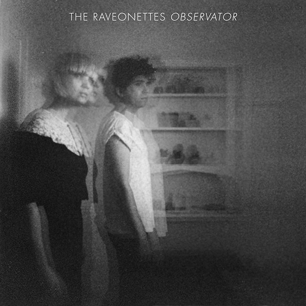
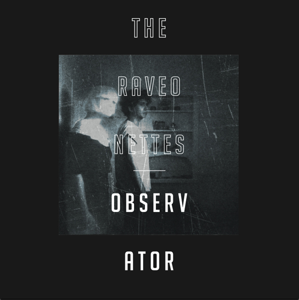
For their next album, Observator, I took a normal photo of them and manipulated the image to seem as if there was a ghostly apparition of each that emanated from their physical form - an observator from the spiritual world. I added various handmade scratch marks onto the image to make it feel vintage. The final cover we used was the most conservative design-wise, focusing on the image rather than type.
Below are some alternate designs that were a bit more adventurous. Although we decided to go with something more subdued in the end, I quite liked these alternate designs. In these, I took one of the band members - Sharin Foo - and digitally manipulated her into something resembling an ethereal ghost - a play on being an observator from the spiritual world (hence the album title, Observator).


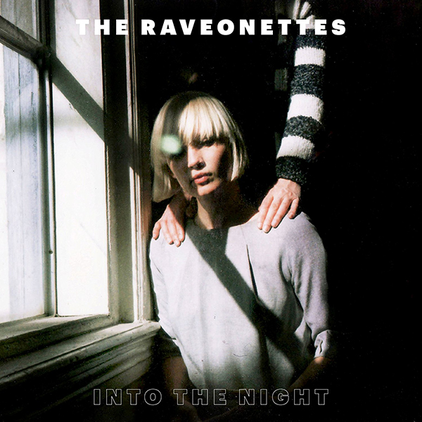
The album cover design we chose for Into The Night was simple and direct. The band gave me a bunch of images to choose from, and I was immediately drawn to this image. The original image was much larger, but I cropped in significantly to show the most interesting portion - a hand over her shoulder. This idea of kinship and supporting one another was the key theme to this particular album, so I let the image speak for itself and had the typography stay out of the way.